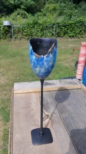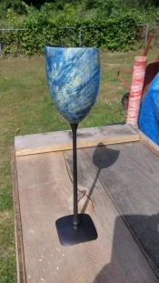
Another WIP goblet

gman2431

Douchebag extrodinare
Banned
Messages
6,260
Reaction score
8,156
Location
Michigan
First name
cody
Since I'm sick as a dog and really don't feel like working on anything lets throw this one out there for review.

Just as the other one I still can add/subtract whatever and plan on posting both of them in the turners forum once done with modifications.

I learned alot from posting the other one and hope to do the same on this one!

Went with the black and blue colors here with ebony and BEB dyed blue and the interior painted black. I ran outta paint so there is still spots that need more.

I made the shaft as skinny as I could go for now and also hollowed the bottom of the base so it stands on four points. Can't really tell tho and I think it needs a more radical curve on top of the base to show it standing on the points.
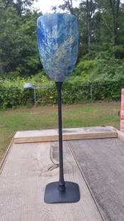
20150918_172857_HDR.webp 20150913_151600_HDR.webp 20150913_151543_HDR.webp
 
That looks nice Cody, great dye job too! Hard to get sweep in a stem that long, have you considered a shorter stem? BTW Sorry I keep forgetting to measure the strips in that veneer, I will be back at it Tuesday, will measure them then...
 
  • Thread Starter Thread Starter
  • #5
That looks nice Cody, great dye job too! Hard to get sweep in a stem that long, have you considered a shorter stem? BTW Sorry I keep forgetting to measure the strips in that veneer, I will be back at it Tuesday, will measure them then...

I've thought about a shorter stem but it just doesn't seem fitting to me for some reason. Maybe I just need to make one outta some scrap and see it in hand before I totally discredit it.

No rush on the veneer! Seriously I'm not in a big hurry.
 
cody, looks quite a bit better than last one! LOL i love the subtlety of the reveal at the base, this is a case of subtle vs scream. Right on for me . Two things i see that you could improve 1. the joinery at the stem and bowl
could be tighter. 2. inside of bowl could use a little more sanding. this is a good attempt man. the next one will be close to righteous
 
Very cool! I love the coloring of the boxelder, and the black fits well with it. Cliff's suggestion about the interior was my first thought about a chance for improvement. I like the long stem, but at the bottom of the stem, I'd consider making the lowest detail a little larger than the one above to keep that curve going from base to stem. I think the base is very cool just the way you've done it!
 
  • Thread Starter Thread Starter
  • #8
Well funny story about the inside.... I had this wild idea to use truck bedliner with the texture on the inside so I left it pretty rough on purpose. I put a coat on it and something wasn't right. Come to find out the bedliner musta sat in my buddies garage for many winters and is junk.

Once I get some more paint I will try and smooth it all out hopefully.

Thanks for the comments everyone!
 
I think the bowl and stem look great, but to me the base looks out of place. Granted I don't know the solution, but it seems like it needs something going on to compliment the top more.
I really like the colors and the shape of the bowl. With the dye job that you did I think bunches of clear coats would be awesome and make parts of it look deeper than others.
All around I think it looks very nice.
 
Cody ... well, you're making it difficult for me to offer critique because this is already better than I could come up with. I love the way the base worked with the subtle undercut.

The goblet and stem and base all feel like they are in the same genre. I understand the comment about the element near the bottom of the stem -- where the stem meets the base could be a bit wider to "rejoin the projected outline" of the stem. I do love the stem exactly the length it is -- if you measure the height of the cup and the height of the stem, I bet the ratio of the two measurements is close to 1:1.6 (the "golden mean" or "golden ratio".)

One aspect that leaves me wondering a bit is the rim of the goblet. A perfect turned rim makes sense, and a complete natural edge makes sense. A part turned/part natural leaves me looking for an explanation of how it got that way (other than "that's just the way the blank was", which implies that the artist is not making the decision!)

Playing a though experiment ... It looks like somebody took a bite out of it -- but there are no toothmarks. It could be that it broke -- but I don't see radiating cracks from where it was smacked with a hammer ... well, maybe I do see one crack line -- perhaps you could emphasize that, and add a few more, to build a story for the piece?

Last comment ...:good2:
 
  • Thread Starter Thread Starter
  • #13
@duncsuss you hit the nail on the head with the blank. It was a piece that only had a natural edge on one big corner and the rest was solid material. I see what you see also in the crack and it truly isn't a crack or a finish flaw. Might be a reflection or something? Possibly a spot that took the dye weird? I will look at it more.

I also love the idea of making the base of the stem wider than the other turning above it. Wish I would have thought of that sooner.

I'm not sure the ratio of length and cannot remember off the top of my head the exact measurement of each piece. Interesting ratio tho. Is that something people try and shoot for?

Lastly don't sell yourself short my friend, these are actually super easy to make. The base was the part that worried me most on how to Even spin it. After tinkering around I put a scrap piece on my faceplate and then used some hot melt designed for wood bonding. You could literally flip it around any way ya want. I almost ventured off into off axis and did some accents with the detailer but I need to keep focused and not get to deep to fast. Haha. Crawl before you can walk! Lol
 
Really nice Cody. I like more about it than I dislike. What I like:

  • Cup shape
  • Cup color
  • The partial natural edge (very cool)
  • Stem length
  • Stem diameter
  • Stem shape
  • Top flare at stem
  • Stem color
Here's the few things I would have done different (not that I even could):
  • Cup interior roughness and color (would rather see same as outside)
  • Lower stem detail - mimic top but a tad larger in proportion with flare
  • Base - not liking the square shape I think round blue-dyed like the cup would be better
Those 3 are just personal preference though. Overall it's a damn good turn and I have never made one that pretty. Really nice job Cody.
 
Interesting ratio tho. Is that something people try and shoot for?
It's a ratio that has been "alleged" to be pleasing to the eye, and is very common in nature, fine art and architecture. Some people say it's a load of nonsense, some say it's divine, and some (like me) don't care if it's divine or b.s. but find it a really useful rule of thumb to use when deciding proportions. Height to width, placement of a divider, etc.

The actual number is 1.61xxxxx (symbol the Greek letter Phi.)
 
Striking piece! Very nicely done! I really like the contrast between the high gloss finish on the bowl and the matte finish on the stem and base.
 
That is beautiful! The only thing I can see wrong is that you should probably eat before you go out to work in the shop. It is not good when you are hungry enough to take a big bite out of your project! :sofa::rofl::rofl::rofl::rofl:
 
Back
Top